Introduction – Bouncing Across the Web
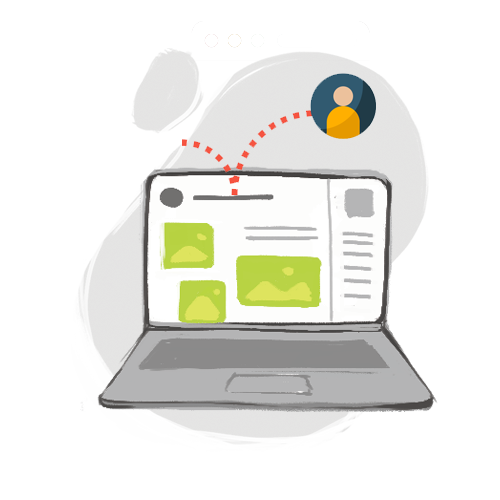
When you browse the web, consider how quickly you can navigate to a page, decide in a fraction of a second, “Mmmm… no.” Then, you repeat the same bouncy activity on a new site, hopping webpage to webpage until you finally find a landing page that catches your attention.
… What about all those pages you bounced through without a second thought?? What if your business ends up like that?!!?
That is why analyzing your online business’s bounce rate is so important!
This blog covers the basics of bounce rates, the percent of visitors who navigate from your site after seeing only one page. We’ll cover how to frame your bounce rate among other key analytics, as well as marketing strategies to reduce the bounce rate. Reduced bounce rate = increased sales, so it’s worth a quick look!
Bounce Rate: A “Bird’s Eye View” of Your Site Activity
It’s best to think of bounce rate as a general “top-down” web metric. While bounce rates do not tell the whole story of your site, they do give an interesting perspective on how many folks click through your page without thinking twice.
For optimizing your online store and increasing sales, it’s worth paying attention to a fundamental metric like bounce rate. Just remember it is only one piece of the Google analytics puzzle, so there is hope for your business even if it currently has a high bounce rate!
Key Steps to Improve your Bounce Rate & Increase Sales
With that said, below are key steps you can take today to improve your bounce rate and boost customer sales. Review to improve your online marketing savvy:
- Page load time
Starting off with a straightforward one here – your webpages should take no longer than 2-3 seconds to load! Why? Over half of visitors will bounce after a 3 second delay.
Run a quick test yourself on a device outside your network to see how quickly your site loads. You may to compress site data, reduce site redirections, streamline Javascript/HTML code, improve server infrastructure, or use a Content Delivery Network (CDN) to help boost up your page load time. User Google’s pagespeed tool linked here to check your load time! Sometime as simple as reducing the size of images on a page can improve its speed, so make sure to check your page load time out!
- “Let your webpages breathe”
Remember the example in the intro – browsing the web is usually a passive activity. Your site must cater to the visitor, not the other way around. If the webpage they land on is cluttered, they’ll say, “Oh geez, I don’t what I’m supposed to look at,” and move on.
Thus, it’s best to break up your webpage info. Do not be afraid of having some blank space in between content! In fact, it “lets the user up” to breath and gives them a second to process your site’s presentation.
- Use heat map analytics to see exactly where visitors’ eyeballs are first drawn
Heat map analytics can be a useful tool for showing exactly where visitors are drawn to most on your webpage. The heat map will “light up” orange/red, informing you where their eyes are first drawn to. Knowing that key info helps you reconstruct the user experience from their point of view. Doing so is a surefire way to increase your online sales!
- Cut down on excessive widgets and sidebars
Having key widgets or sidebars helps bring a helpful dynamic element to your site. However, some businesses use them to the point it overtakes and distracts from the actual content! Moreover, added sidebars could also contain Javascript or HTML errors that cause issues for users. Tactfully employ widgets, as they will potentially sap your customer’s attention away from placing an order.
- Give each webpage a central focus that funnels visitors to a sales deal
Help visitors keep their eye on the prize! Each webpage should contain a healthy balance of content and “call to action” buttons that funnel them along to the checkout page. In other words, make sure each webpage brings it back to your “bread and butter” for increasing sales.
- Clear, easy search bar that covers all your pages
The best-performing websites have an easy-to-use, fluid search bar that searches all content within the site. Think of it like constructing a “Mini-Google” that helps visitors sift through all the products and pages you have available! The quick the search bar loads as the user types, the more likely they are to purchase products and boost your sales.
- Optimize mobile versions of your online store for increased sales
Some Shopify owners think they are all set after setting up a “desktop” version of their site… but remember we live in the Instagram Era. You neeeeeeeeed to craft a mobile-friendly version of your store that effectively condenses your webpages down to a phone screen. This is why successful businesses research creating a separate “app version” of their product. They want to streamline the mobile user experience to boost their sales!
Conclusion – Ad360 is Here to Help Reduce your Bounce Rate!
If you feel implementing any of the above-mentioned ideas sounds too time-consuming, reach out to try a free demo at Ad360 today! We offer a free evaluation of your website’s metrics, providing concrete, actionable marketing solutions for your site. That way, you can be happy, productive, and successful while you increase your sales online 😊 Cheers, we hope that you enjoyed this breakdown of bounce rates!
