The Role of Visual Ads in E-Commerce Advertising
Digital marketing is arguably defined by the ability to use multimedia (text, photos, videos) in combination to promote your product. When they say “a picture is worth a thousand words,” here are some stats to back that up:
- Visual content is processed by the brain 60,000 times faster than text
- Visual stimuli makes up 90% of all info transmitted daily
If you want to make an impact on your customer, improving your visual ads could be the key to increasing sales on Shopify! This post reviews the importance of visual ads in ecommerce, as well as how to deploy ad visuals while trying to increase sales on Shopify.
Importance of Digital Ad Design
In the past 10 years, users online have gotten used to bombardments of visual ads across the web, as well as mobile apps. It’s commonplace to be reading a news article, then suddenly see a visual ad banner for footwear or something completely unrelated to the article itself.
That’s the first key reason digital ad design is crucial to increasing sales on Shopify – you want your visual ad to be so eye-catching it literally draws the user away from what they were doing and toward your site! If the visual looks cheesy or unprofessional, users may be wary that the product offered is a scam or low-quality. Your digital ad design quality needs to match your product quality to boost your Shopify sales.
Digital Ad Design Aesthetics – The Key to Increasing Sales on Shopify
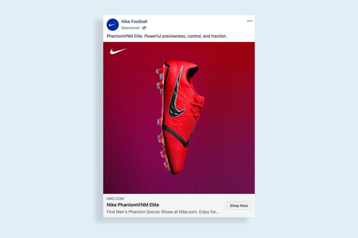
If you notice, major brands like Nike or Apple have perfected the art of making sleek, beautiful, simple ads that showcase their products with vibrant colors and dynamic patterns. Some of the best ad visuals are basically a beautiful digital canvas with the flagship product in the middle, and a simple slogan like, “Get Ready,” or something that simple.

High-resolution photos, edited to enrich the color scheme, may immediately draw the user’s eye. Additionally, putting your brand logo in the middle of a beautiful colored background may enhance their perception of your product line. To increase sales on Shopify, you need to demonstrate that your digital ads compete with the sleek professional designs found across the web.
Keys to Digital Ad Design Success
To successfully increase your Shopify sales, Ad360 has provided a few key pointers to follow when deciding on your final ad design:
1. Use high-resolution photos of stock photos, models, or your product centered on the ad visual
2. Pick colors that complement each other
3. Use big colorful fonts for a short, eye-catching message (e.g. ’50$ OFF!’)
4. Put your product or brand logo behind beautiful yet simple colored backgrounds with bright or neutral hues
5. DO NOT CROWD THE VISUAL OR OVERCOMPLICATE. ONE PRODUCT, ONE IMAGE! Only use multiple images if you have a specific design model in mind
6. Gifs and videos work too, but make sure the thumbnail is as aesthetically pleasing as a still visual
Ad360 Can Automatically Generate Eye-Catching Visuals for Your Business
A recent survey found that a majority of e-commerce business owners would prefer automatically-generated ad visuals and designs: it would save them precious time to focus on day-to-day operations. Thus, it could be argued that automating your ad visuals is a keystone to increasing sales on Shopify.
If you want to try automating your ad visuals, try a free demo by Ad360 today! On top of a centralized dashboard for all ad campaigns, as well as making ad campaign creation as simple as one click, Ad360 automatically extracts data from your Shopify store to create ad visuals. From there, you will have multiple options of which one to release across the web, drawing in more visitors and increasing your sales on Shopify 😊
