Why “Call to Action” Buttons Make Such a Difference
Introduction: No Call to Action, No Deal
I recently came across a beautiful website – one of the best designs I had seen in a while. They were marketing CBD products, and the entire aesthetic was simple yet elegant. Even more, the content wasn’t all “puff piece” superficial garbage; it went in-depth on all current research surrounding CBD, and each webpage seemed to load quicker than the last!
Needless to say, I was impressed… however, I didn’t end up making a purchase. Is it because I didn’t like the website? On the contrary! I had rarely felt this much trust after learning so much thanks to the store content. The problem is, I just kept scrolling and reading, and the website never reminded me that it was actually selling some products. If it had, I definitely would have bought it.
The problem is that after priming me up all this excellent info on CBD, it didn’t entice me to buy the products the website described so well.
I got a call from a friend, got up to speak outside… and totally forgot about the site. It was like my brain had filed the store under “purely informative content” rather than “potential new product.”
What was this lovely site missing? Simple. It lacked an effective “Call to Action” button to close the deal. As a potential customer, I never shifted gears from “just browsing” to “just bought.” It’s not that I didn’t love what the store offered, and how they presented it! The site just never prompted me to convert the sale.
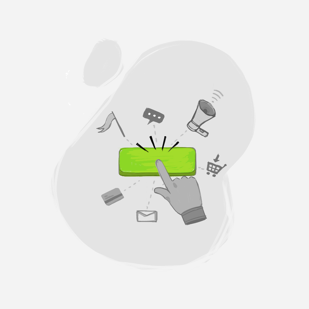
This blog explores just how powerful a well-placed Call-to-Action (CTA) button is for growing your Shopify business! 70% of small businesses neglect this crucial promotional tool, which is shocking considering that a well-placed CTA button can multiply your conversion rate several times over.
Seeing as the average conversion rate for visitors to Shopify stores hovers between a paltry 1 and 3 percent, let’s explore exactly how and why CTA buttons are a turnkey solution for boosting your sales, and making your Shopify store a resounding success 😊
3 Second Attention-Span: People Skim the Web, They Don’t Surf it
The primary purpose and function of a CTA are not hard to grasp. It’s a clickable button on your website that gets noticed and encourages visitors to head right to checkout with your product. In traditional marketing, it’s that tagline at the end of commercials yelling, “BUY NOW, OR YOUR MONEY BACK! AVAILABLE FOR A LIMITED TIME ONLY!”
We know, that is super obnoxious. However, there are tasteful, elegant ways to present a CTA button on your website that, if anything, add to the aesthetic and dynamic function of your online store! On top of that, nearly half of all Shopify stores have a CTA link visible within 3 seconds of users scrolling their website. To stay competitive and boost sales, Shopify owners have to consider their marketing presentation for CTA buttons. Otherwise, they risk losing potential customers. Not because their product was deemed inadequate, but because it felt like too much of a “pain in the ass” to quickly checkout. Harsh, but true ☹
Core Design Features to Consider for a Successful CTA
The next natural question is, “How do I design and place my CTA, then?” Well, to start, you need to consider the core elements that make up the design of the CTA button itself:
- Color – How does the CTA button’s color differ from the rest of your site? The pattern, shading, and texture of the button should stick out from the rest of the webpage, without looking clunky. Easier said than done.
- Font – Using a bigger size font can also help optimize your CTA button for increased Shopify sales, so keep that in mind.
- Written text – Beyond a snappy message that captures your customer’s attention, even slight adjustments (like using 1st person vs. 2nd person) dramatically impact Shopify sales conversion rates.
- Background – Marketing researchers have found that CTA buttons surrounded by zero clutter and blank space increased conversion rates by 232%. Imagine that just “decluttering” your CTA button could increase your conversion rate from 5% to 11%.
Where to Place the Perfect “Call to Action” Button
First off, don’t limit your CTA buttons to only one place; the Shopify stores with the highest sales put tastefully made CTAs in multiple places on their webpage!
On top of that, it’s crucial to run A/B testing when trying different marketing strategies with your CTA messaging. That way, you can get valuable feedback on what is – and isn’t – working to increase your Shopify sales. The tracking data from what customers “click on” while browsing your site will tell you which CTA design best optimizes your Shopify sales growth.
Wherever your visitors’ focus concentrates the most, that is your “X marks the spot” for a clickable CTA button. This “sweet spot” for your CTA will change depending on whether the ad runs on the computer, tablet, or mobile, so make sure to keep that in mind! For example, placing the CTA button within the “natural thumb swiping range” can make a big difference on mobile, while placing the CTA “above the fold” in your email copy streamlines the checkout process on a laptop or tablet.
If you feel you would benefit from some support in perfecting your CTA design and message, please reach out to Ad360 today for a free demo!