Welcome to Ecommerce Success by Ad360, the channel where we share tips, news, best practices to help business owners be happy, productive, and successful!
A Landing Page is where users land after clicking on an ad. Usually, Landing Pages are laser-focused towards your main goal in that context. If your website sells different categories of products, appealing to various audience segments, you should probably have multiple Landing Pages, with each targeting a specific audience segment and/or product.
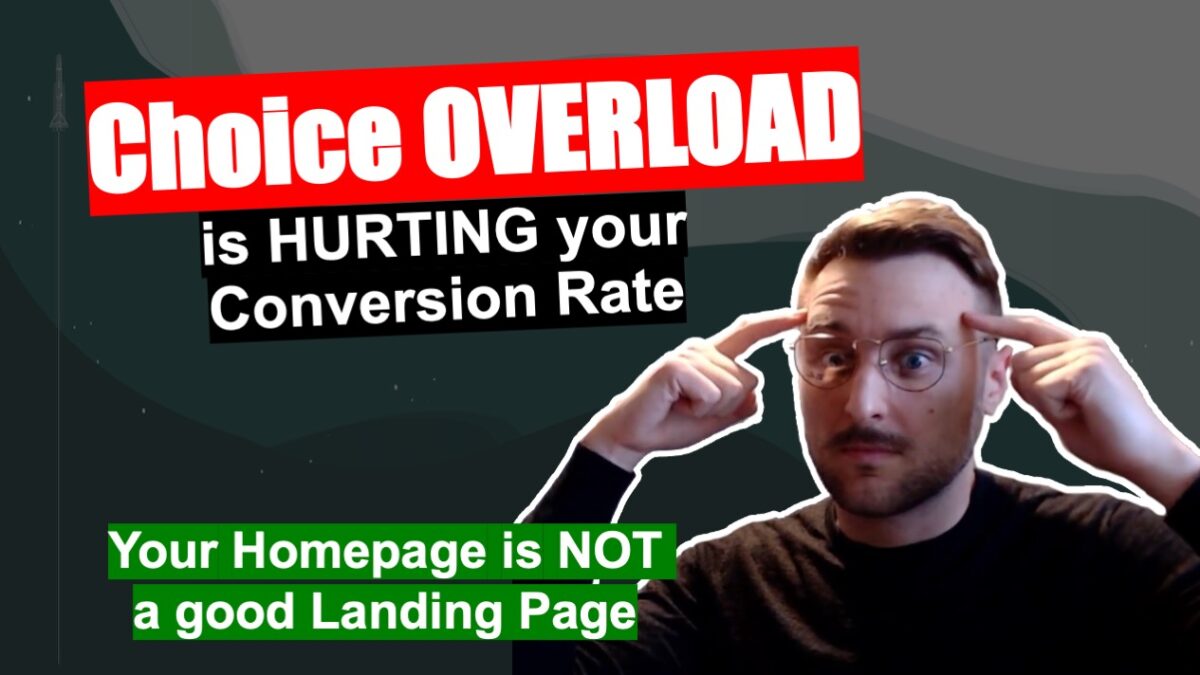
The reason why the Homepage doesn’t make for a good landing page is that it usually contains varied content. Perhaps counter-intuitively, having more options isn’t necessarily a way to increase the probability of your website visitors to take an action.
Quite the contrary actually says the Choice Overload paradox: having too many options to choose from deters some users from making a choice at all.
For this reason, a Homepage containing a lot of different products may have a lower conversion rate than a dedicated landing page, meaning that in most cases, you don’t want to bring users who click on your ads towards your Homepage.
Wishing you a lot of success!
